This is Part 3 of a series, if you missed Parts 1 or 2, click here:
1. NBA logo rankings for all 30 teams – worst of the pack
2. NBA logo rankings for all 30 teams – middle of the road
As a branding agency, we like to take note of the work that’s out there in order to stay up to date on the latest trends and reevaluate if older designs have held up to the test of time. Sports logos are some of the most prominently displayed and remembered in all of design. People get them tattooed on their body, they buy merchandise of all kinds, and paint their houses the color of their favorite sports teams. In other words, they’re a big deal to the people who care.
I’m a giant NBA fan and have been for as long as I can remember. Over the years, I’ve noted amazingly well-aged logos, as well as those that crashed and burned into the haze of basketball-past. This is my evaluation from a brand designer perspective of all current NBA logos before the opening of the 2019-2020 season. Let the controversy begin!
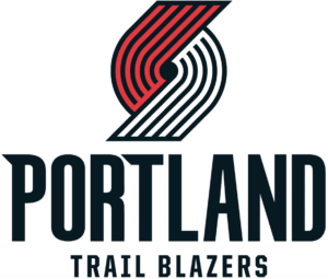
10. Portland Trailblazers
One of the most divisive logos of all time, the infamous pinwheel design. As a fan of abstract/minimal design, I personally love it. Who else in the NBA has an abstract shape as their logo? There’s no playing it safe basketball, no shield to fall back on, no lame mascot, just pure design id. The pinwheel streaks and spins, it meshes the 3 main team colors together in a spiral with a ton of motion conveyed. Is it a “trail blazer” in graphic form? Not in the slightest, but would you rather some lame gold miner graphic? I don’t think people even necessarily have to see the true meaning of the logo (5 offensive players streaking towards 5 defensive players) to appreciate the dynamic image.
Things I would improve
I don’t have much to critique here. They set the logo free from its black box in 2017 and cleaned up the lines for a wider range of applications. My only nitpick would be to fix the T in Portland. It’s really strange and screams of a stakeholder trying to add their stamp to something.
9. Atlanta Hawks
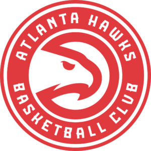
Glinting directly into the sun, a flash of a shadow was almost imperceptible to the rabbit. Suddenly the shadow expanded and two talons swiped from behind the sun’s rays as the hawk slammed into its prey. Look at this hawk design. Simple, elegant, menacing yet regal. All with a simple outline and an angular eye. They’re a basketball club because why not, and they lean into the soccer club seal look by adding the ring around the hawk. It’s a fantastic example of taking something from the past and modernizing it without losing its flair.
Things I would improve
The secondary logo is a pure simplification and the final evolution of this design. It should be implemented as the primary immediately. Also if we’re critiquing, get rid of the sports font weird extended crossbars on almost every letter, especially the A’s and S’s.
8. Denver Nuggets
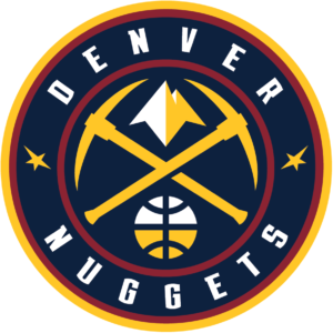
I’m so glad Denver ditched the gold and baby blue old western font version of the logo and transitioned their secondary logo into the primary slot. It’s the move I want quite a few franchises to do and it works wonders. A simple badge, some crossed pick axes to convey gold mining, an understated mountain, and a tasteful basketball that doesn’t dominate the scene.
Things I would improve
This logo suffers a bit from sports font syndrome. Also, the stars are an atrocity and should really be updated. Their secondary “Mile High City” logo could use some work, but it’s not terrible to look at either. Overall, this is a pleasant logo to look at.
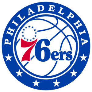
7. Philadelphia 76ers
We’re getting into the new hotness here. The 76ers rebranded in 2015 and haven’t looked back. The retro font is at home here in a name reminiscent of olden times. The amazing 13 stars in a circle to represent the 13 colonies is a brilliant addition to the swoop of the 7. The colors are patriotic, but subdued with a mostly blue tone. To go along with their new Phila jerseys in cream and amazing center court design, they continue to do great things with their brand.
Things I would improve
This logo could use some simplification. It doesn’t need a basketball in the background and the font in the ring could use some finessing. Dare I say move towards their secondary logo or even their original logo a bit?
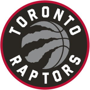
6. Toronto Raptors
As cool as a cartoon dribbling Raptor was, this logo destroys its old counterpart. The only time you will hear me say this, I love this basketball. It takes the tired old cliche of a basketball in a logo and adds a fantastic twist with the menacing raptor claw marks tearing out the side of the ball. They even forgo the sports font trend for something I haven’t seen in another NBA team and frankly is underutilized: the old-school “varsity sports” style font. The lighter font works here in contrast with the overly dark imagery. Also, their North jerseys are just magical.
Things I would improve
The Raptors are leaning pretty heavily on Drake as their brand ambassador and letting him get away with quite a lot courtside. They introduced OVO themed jerseys and have an alternate OVO colored logo. With a lack of black/gold teams in the league, I can’t help but to cast my vote for the Raptors to go full gold themed.
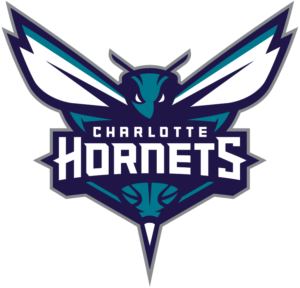
5. Charlotte Hornets
The 90’s hornet was cute and all, but so so schlocky. When the Hornets finally got their team name back after some NBA team shuffling, they went with a full intimidating rebrand that just nails it. The hornet is staring into your soul and baring its stinger. The whole shape of the logo forms a strong triangle and the font has its own stingers in case it needs to hold its own away from the hornet. They also took the original bright teal and purple color scheme and modernized it away from its 90s jazzercise vibes.
Things I would improve
The gray outline could easily be removed and virtually nobody would notice. Honestly, I love this logo and would like to see more explorations like their alternate logos.
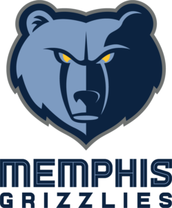
4. Memphis Grizzlies
Despite being thousands of miles from the nearest grizzly territory, Memphis owns this mascot and team name. After their move from Vancouver to Memphis, they erased this cursed monstrosity and replaced it with a terrifying (in a good way) grizzly portrait replete with glowing yellow eyes. The font feels fresh and unique in the league, the colors are fantastic and represent the city well.
Things I would improve
In 2018 they cleaned up the font, but for some reason jumped on the gray outline trend. I would remove that gray outline and call it a day on this fantastic design.
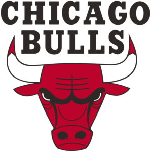
3. Chicago Bulls
The final iconic old-school design and a gold standard for all designers to strive for. The infamous Bulls logo is a giant among graphic designers. Designed in 1966 by Dean Wessel, it is the only original logo still being used in the league today without any alterations. The bull represents the city’s historic meat packing industry and the red horn tips and menacing face are meant to convey the danger this bull represents. It’s symmetrical, clean, and straight to the point. Better designs are hard to come by.
Things I would improve
That font though. Oh that 70’s cowboy style font. If anything in this logo could use an update, I think a designer with respect to the team’s tradition should take a stab at updating the font. Honestly though, long live the king of the original logos.
2. Minnesota Timberwolves
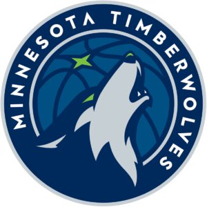
That is one aggressive wolf. Well-designed, clean lines, simple, and ferocious. Oh and it has a bright green eye and nose highlight. It even blends into the dark blue background ring, highlighting how wolves can camouflage into the shadows. The font is refreshingly modern, although the missing crossbar on the A seems slightly unnecessary.
Things I would improve
My only critique is highlighted by this design, wolves are pack animals. What if instead of a basketball with a star in the background, there was a treeline and some glowing eyes? Metal A.F.
1. Milwaukee Bucks
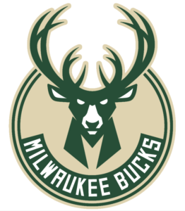
We’ve arrived at the crème de la crème, the pièce de résistance, my favorite sports logo in a long time. This is the most fearsome prey animal to ever walk the earth. It’s bold, simple, and everything you could hope to achieve with a sports logo. Even the color scheme and font are great. The cherry on top is the basketball logo hidden in the horns.
Things I would improve
I didn’t notice it at first, but there’s a hidden M in the buck’s neck that I find a bit blocky now that I see it. I think that can be massaged a bit. I would also brighten up the cream color a little bit to help this baby shine.
Thanks for following along in my critiques of NBA logos. I hope you find it informative and interesting to hear a branding designer’s professional take on your favorite team’s logo and know that I tore my home team’s logo apart as fairly as I could any others.
