This is Part 2 of a series, if you missed Part 1, click here:
NBA logo rankings for all 30 teams – worst of the pack.
As a branding agency, we like to take note of the work that’s out there in order to stay up to date on the latest trends and reevaluate if older designs have held up to the test of time. Sports logos are some of the most prominently displayed and remembered in all of design. People get them tattooed on their body, they buy merchandise of all kinds, and paint their houses the color of their favorite sports teams. In other words, they’re a big deal to the people who care.
I’m a giant NBA fan and have been for as long as I can remember. Over the years, I’ve noted amazingly well-aged logos, as well as those that crashed and burned into the haze of basketball-past. This is my evaluation from a brand designer perspective of all current NBA logos before the opening of the 2019-2020 season. Let the controversy begin!
20. Dallas Mavericks
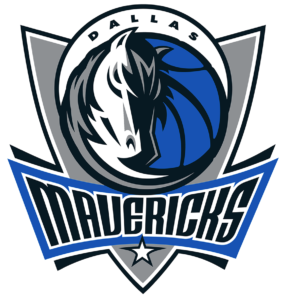
This design is just busy. If it were solely the horse in a circle shape, I would be bumping this significantly up the list. The designer really lays out some great pieces here, but ultimately less would be more. Let’s lose the gray shield, the “bordering on swoopy” lines, and straighten up that distorted star a bit. Maybe add a pop of their green somewhere focal, like the horse’s eye? And which of those two black shapes is the horse’s eye?
Things I would improve
I’d love to see some explorations similar to the newest Bucks logo (coming later in this list) or let the stallion run free like the Denver Broncos logo.
19. Sacramento Kings
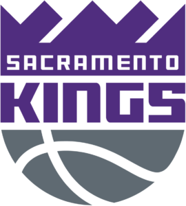
I want to give the Kings something. They have great colors to work with, a classic name, and sometimes pretty solid jerseys. But the city of Sacramento has held onto this team despite its logo, not because of it. The crown itself is a weird jaggy mess that is unpleasant to look at and confusing in execution. The font is a forgettable square block with some weird sharp, non-sharp mismatching corners. If this were the whole logo, it might be a bit higher, but why is that purple area sitting on top of a gray half-basketball. Is that a representative of a king? Does it look regal?
Things I would improve
First of all, just switching to their secondary logo would be a world changing improvement and vault them possibly into the top 10 alone (I’d still fix the crown). But why stop there? Royalty, regal imagery, intimidating lions, and a great team name mixed with the color purple and accents of black, gray, and white are just asking for a proper redesign.
18. Phoenix Suns
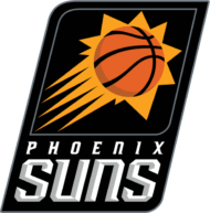
I hate to do it, but this logo is begging to be broken free from its black boxed prison. That sun (on a purple backdrop in its initial form) was an NBA icon in the 90s. It was the hotness of the era, and it hasn’t quite dated horribly, but it’s been trapped in a black case of emotion. It’s also accompanied by an oddly tribal tattoo looking bird as an alternate logo that is just not worth using in any form.
Things I would improve
Set my sun free. Reunited it with its purple compliment. Explore the vast wealth of desert imagery and mix it with a blazing sun watching over all. Use some better Phoenix imagery. I believe in the Suns and know there is a better version out there.
17. Los Angeles Lakers
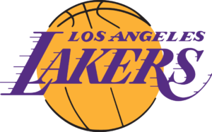
And here we find ourselves, old friend. The nearest and dearest to my heart (I’m from LA and remember Magic Johnson playing on TV). Number one in my heart, middling-to-poor when I look at it as a designer. Despite holding up to the test of time, this is a forgettable logo. Ask anyone in LA to draw the Lakers logo, I guarantee nobody can get close. The symbol for LA sports fans is the overlapping LA monogram of the Dodgers for a reason. The fonts are reminiscent of 70’s hand-painting, with random-length speed lines jetting off of the word “Lakers” which doesn’t denote speed on it’s own. The entire symbol is basically a giant gold basketball with purple writing over it. There is no creativity or imagination and it is frankly uninspired. Also, the name itself should have changed long ago to something that remotely has to do with LA, but much like the “Trolley Dodgers” of baseball, this transplanted team’s name has long since stuck and won’t change in the foreseeable future.
Things I would improve
Whew, so with that off my chest let’s look forward. The name itself is always going to be a mismatch, but it has become more than lake imagery. Lean in to the Southern California vibes or surf culture and ditch the Giraffe. With the “Showtime Lakers” of the 80s, Hollywood glamour and spectacle had their team. Bring some of the bright lights and Hollywood back into the mix. Maybe they can take on the Dodgers with their own take on the LA monogram in a sexier font.
16. Miami Heat
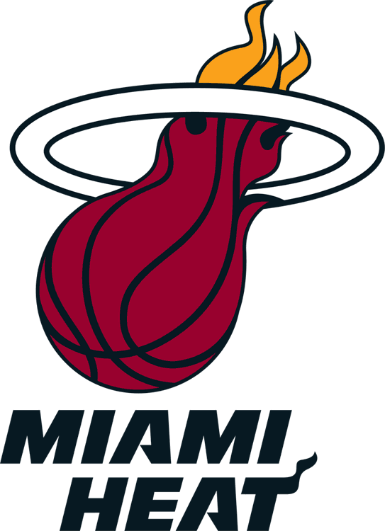
As much as this is a beloved mainstay logo to its loyal fans, it’s only from 1999 and reflects as much. The fireball imagery torching a hoop is a fantastic visual metaphor, but poorly executed. Why does the ball melt into a flame shape instead of having a ball that’s actually on fire? Why is the flame yellow above the rim and red below with zero transition? The line work on this would kill any respectable tattoo artist. It’s thick in some areas, thin in others, and filled in black in two flame pockets that don’t match lines on the upper yellow part of the flames. The rim the ball is going through is generic and boring, but at least the lines are consistent. I do love the font for some reason, it gives a spicy edge that feels very Miami.
Things I would improve
Heat is an abstract concept, but it comes with some great imagery nonetheless. First off, a simple rework of their current concept could yield immediate results. Fire imagery abounds and fiery red really works well for sports teams. Miami is a vibrant, beautiful beach town. There are tons of references between their upbeat nightlife and latin community (El Heat is dipping a toe, but feels like pandering). Fans want their Miami Vice, just give them full on Miami Vice.
15. Washington Wizards
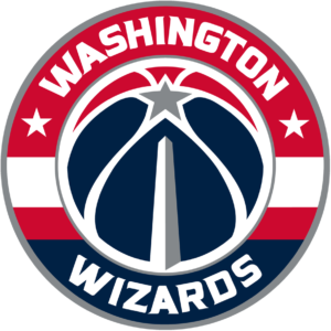
The Wizards arrived into the league in 1997, when the NBA noticed that glorifying bullets in this modern American climate was probably a bit uncouth. They came out with a bang of a flat design abstract wizard ready to ball on the non-magical. It was cheesy, but done extremely well. In 2014, they let the magic die and gave us their take on “America, The Team.” This is done about as well as possible and I commend the designers. They worked stars and stripes subtly into the design, hid the Washington Monument in a basketball seam, and made a slick new basketball shape. They did use another weird sports font that just doesn’t work, but that’s minor execution. They’re this low on the list though not for this design, but for the potential of the “Wizards” brand.
Things I would improve
See my write up on the Orlando Magic, but magical imagery could be amazing if properly executed. Michael Weinstein once again knocks it out of the park with his wizarding rendition. Wizard imagery is fantastic and evocative and Harry Potter is still thriving. Alchemy could be an amazing direction as well.
14. Boston Celtics
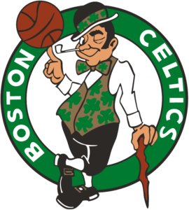
I’m so sorry to both Boston fans and Zang Auerbach, brother of legendary then-Celtics coach Red Auerbach. This logo served its purpose so well that it was never scrapped when it went out of style, when it become antiquated, when it became a caricature of regressive views towards the Irish, and was even colorized for some reason in the 90’s to try and keep it around. I won’t knock the iconic design other than to say… it’s time.
Things I would improve
Lucky should move into secondary logo status, with a close up of his winking face and pipe. With the primary logo, Boston basically owns the color green, anything Irish to represent the heritage of the Boston area, and the clover/shamrock symbol (at least in basketball).
13. San Antonio Spurs
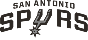
We’re pretty far into the list and down towards the logos I really like. This logo is clean, minimal, and pretty timeless. The Spurs could hold onto this for quite a while and be ok, but why be ok?
Things I would improve
The Spur is such a specific image that we’re fairly limited. Designs could maybe be broadened out to cattle ranchers, or cowboys, but even then we’re close to Mavericks territory. Fans love the O.G. fiesta theme, there’s a lot of latin artwork that could be looked at. The Spurs themselves have been one of the only NBA teams to use military themes, dare they be bold and try out some military imagery to solidify their ties?
12. Golden State Warriors
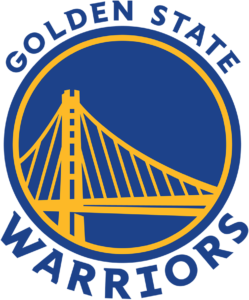
Unlike many fans, I actually somewhat enjoy this logo. It’s not the best, but it’s not half bad either. The bridge is off-center, which is annoying, but it’s specifically done so that on jerseys the player’s number can go in the upper right blue area. The Warriors recently updated logos and switched from the tragically outdated Copperplate Gothic to this more modern, but still annoyingly sports-y font. The bridge is fairly well represented, and the colors work.
Things I would improve
First of all, it’s a nice bay area gesture to display the bridge connecting the team’s old home in Oakland with their new arena in San Francisco. But, come on, the Golden Gate Bridge is like 3 miles away, used to be on your logo, and a world landmark. Go with the gold. Honestly, just revert back to the 70’s logo with maybe a little modernization. Or if the Warriors really want to be bold, maybe make another attempt at actual warrior imagery. This take could be fierce, but I worry that the modern NBA is leaning away from anything menacing.
11. New Orleans Pelicans
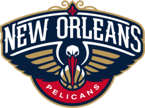
I’ve never seen a Pelican and thought “intimidation,” but here we are in this bold new world. This logo does a lot with so little. They’re limited to one bird that isn’t particularly menacing, and somehow gets a ton right. The fleur-de-lis capstone is great tribute to the city, the colors are New Orleans, and the logo is really well designed overall. I’m not a fan of the basketball as the bird’s body, but that’s minor. The font choice for New Orleans is fantastic, but the Pelicans font could use some punch. This logo is only so low because (despite my previous musings) the NBA has some fantastic logos. Some iconic old logos hold their own and some new ones are just amazing.
Things I would improve
Overall, I just wish they would switch to their secondary logo. It’s a fantastic minimal representation of the original and works much better in almost any application.
This is Part 2 of a series. Parts 1 and 3 here:
1. NBA logo rankings for all 30 teams – worst of the pack
3. NBA logo rankings for all 30 teams – best of the best
