Lead Product Designer
User research
Product design
Design mentorship
Figma
Miro
Eaze is an online marketplace that helps provide legal access to cannabis through safe delivery.
As a team member of Eaze, I led design for the 6 person consumer team on Eaze.com, the driver app, inventory management system, and all mobile shopping apps. I was tasked with defining what the future of cannabis delivery should look like.
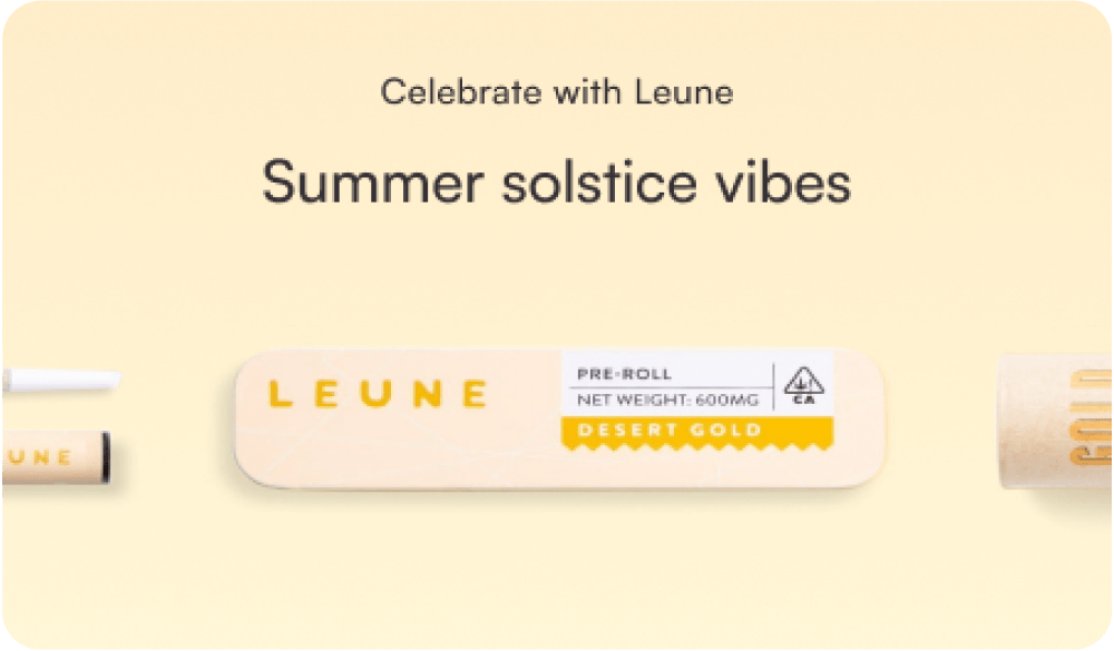
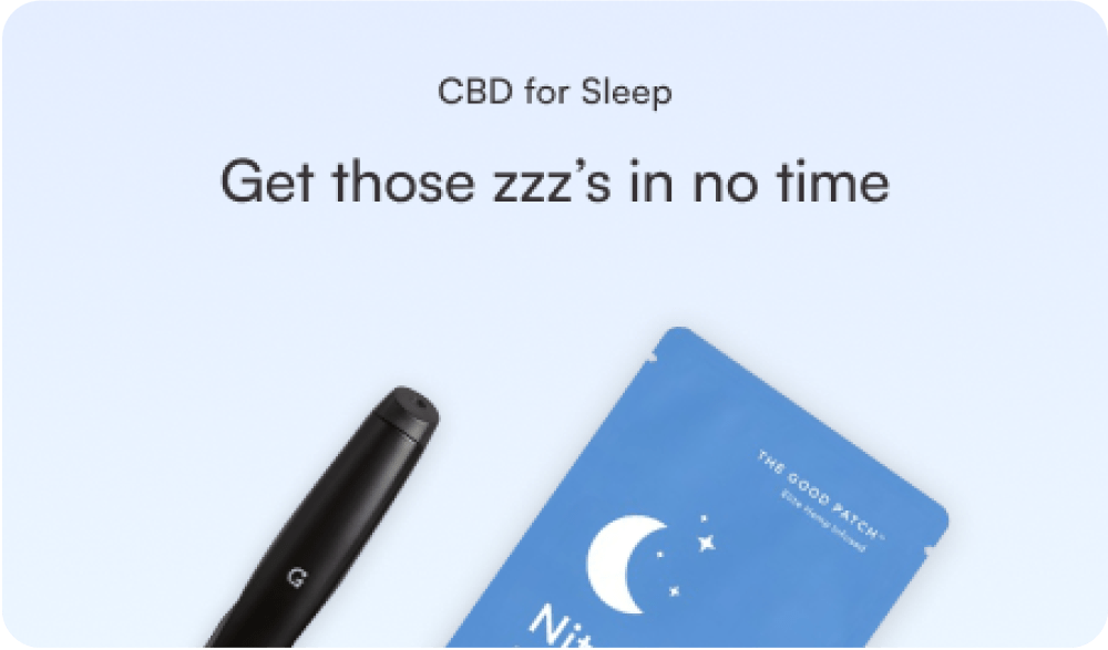
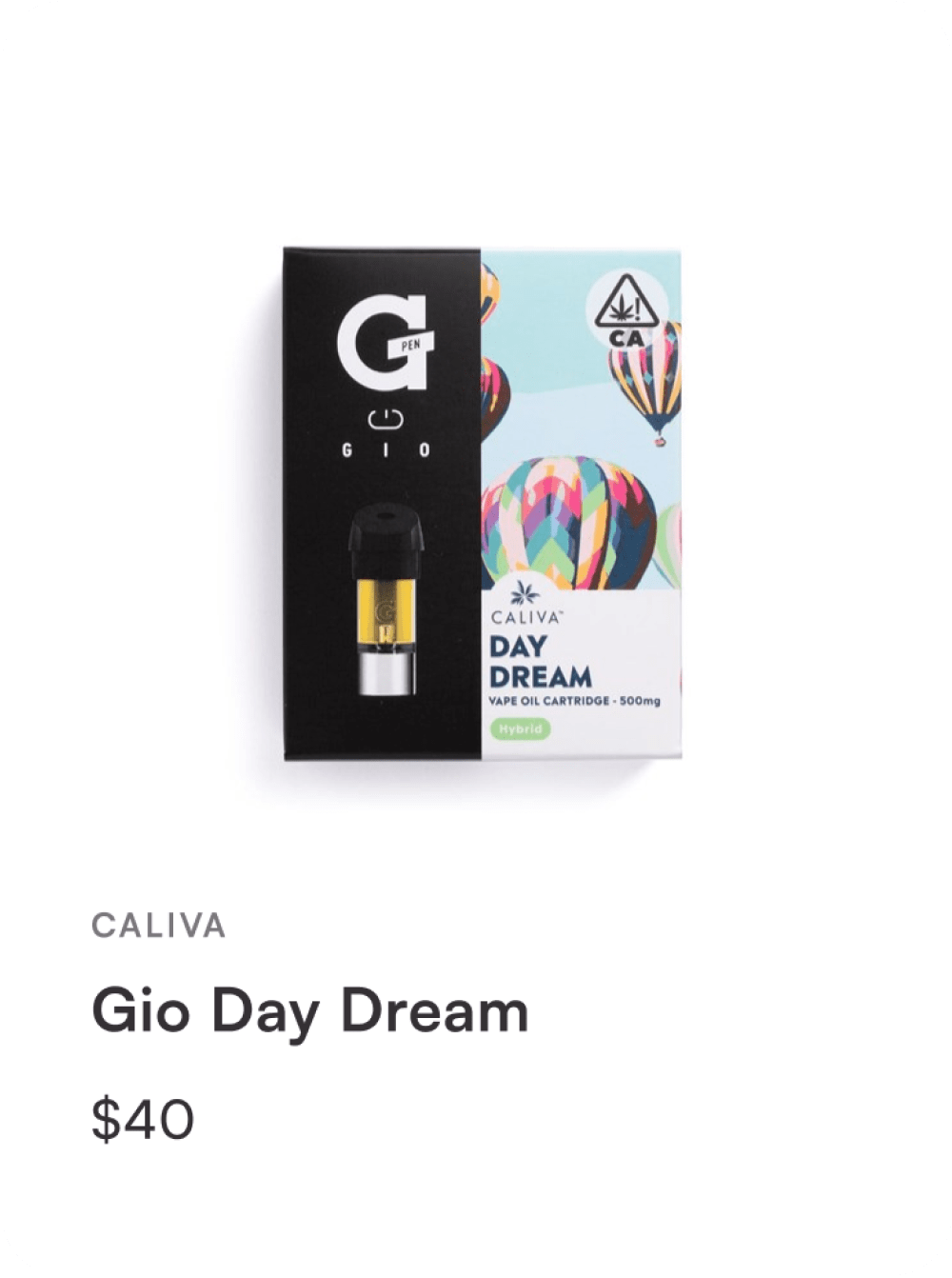
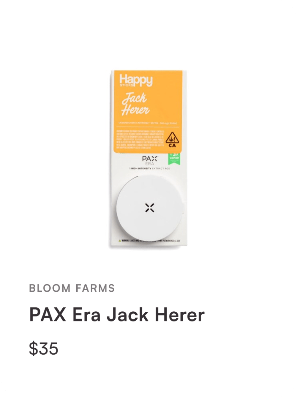
Cannabis in America has long been stigmatized and negatively depicted in media. Even after California legalization, people felt intimidated by their options.
Meanwhile, millions of Americans were waking up to the beneficial effects of various cannabinoids, both on mood and physical ailments.

Eaze was just beginning its Product journey, so I gathered key stakeholders for an initial strategy session. During whiteboarding, we decided that although we had a barebones shop, we needed to completely rethink the shopping experience.
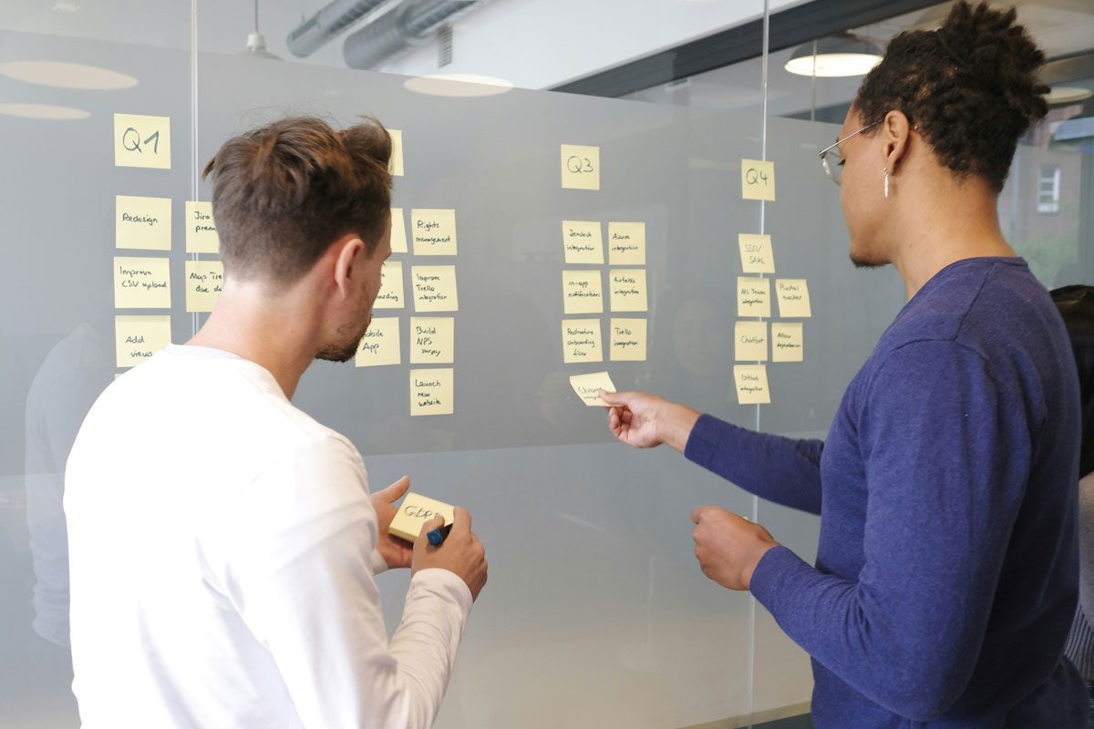
I spearheaded the project, along with a project manager. I led two junior designers and managed relationships with software engineers, the Head of Marketing, and several directors.
I began the process by conducting user research alongside a junior designer. We interviewed current Eaze users about their habits, as well as people on the street about their cannabis shopping experiences.
Beginners
New users were confused on what to buy. They felt intimidated by the complex terminology (terpenes, CBD levels, tinctures) and unsure of what levels of THC or CBD were “normal” or right for them.
Experienced users
Experienced users wanted a storefront that didn’t feel like a side-alley. They wanted to know everything they could about the product they were buying, and they generally knew exactly what they were looking for.
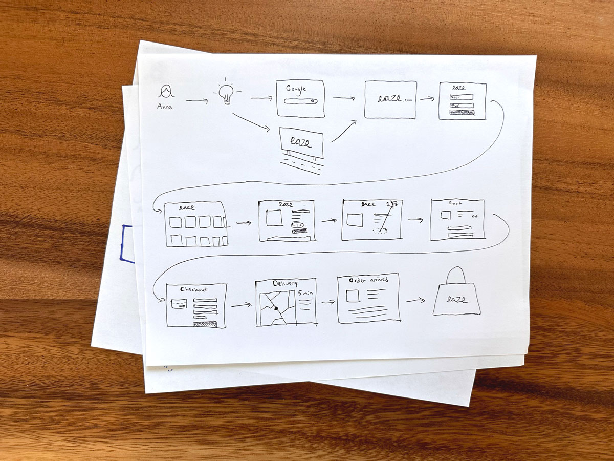
With user interviews running, the project manager and I mapped out key workflows, referencing competitors, and creating a model of our ideal version of the Eaze shopping experience.
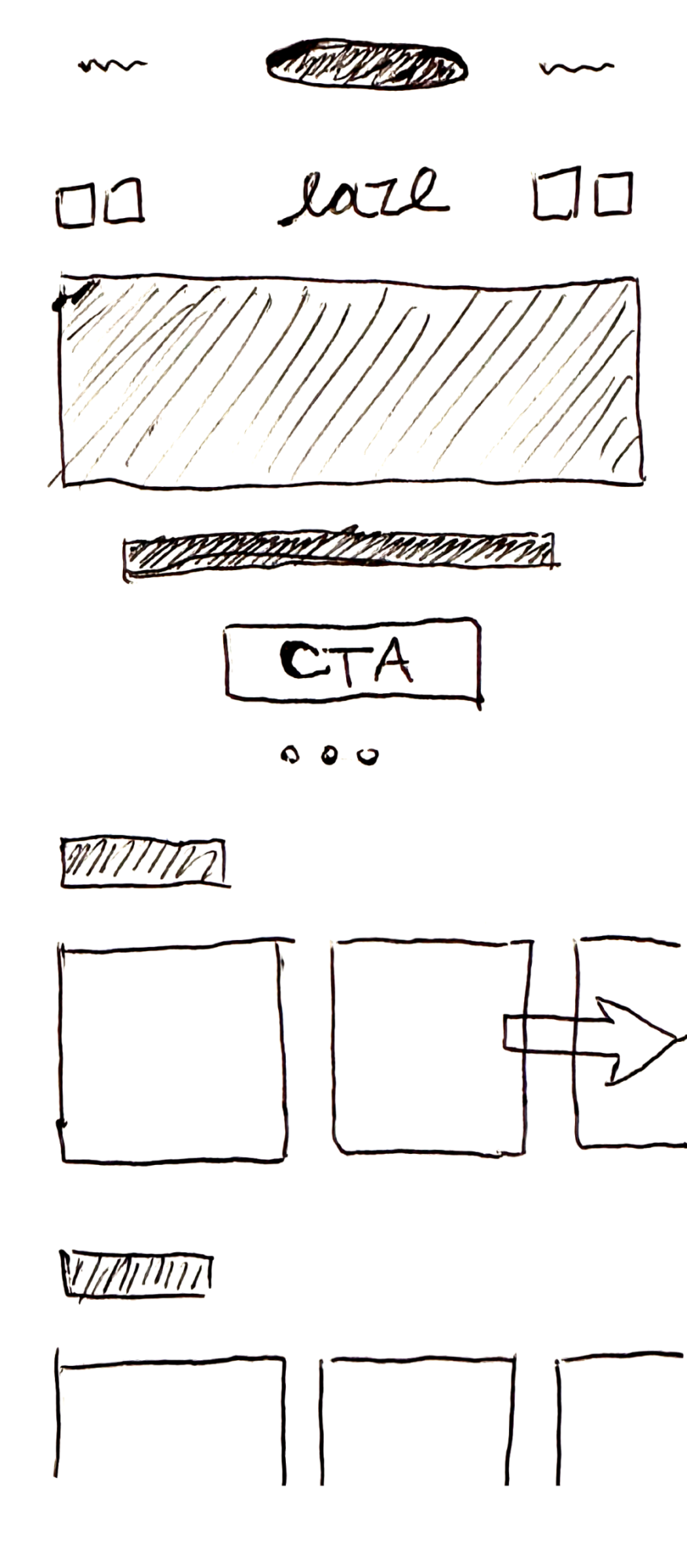
I designed rough wireframes of critical screens from the workflows. These shed light on areas where flows could be improved and focus needed to be shifted, including a more significant emphasis on product imagery and brand recognition. I then created high-fidelity mockups from these learnings.

I brought in more existing Eaze users and conducted additional coffee shop interviews with non-Eaze users and even cannabis-hesitant users.

I incorporated the new feedback into my designs. In-house users felt that it was a night-and-day improvement in accessibility to the cannabis space.
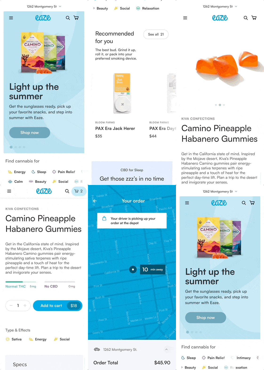
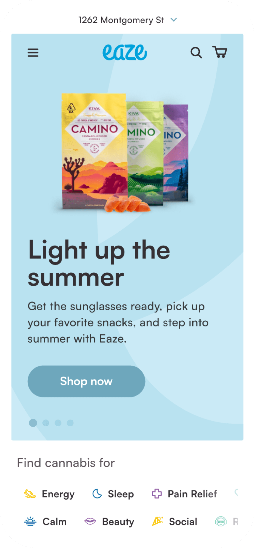
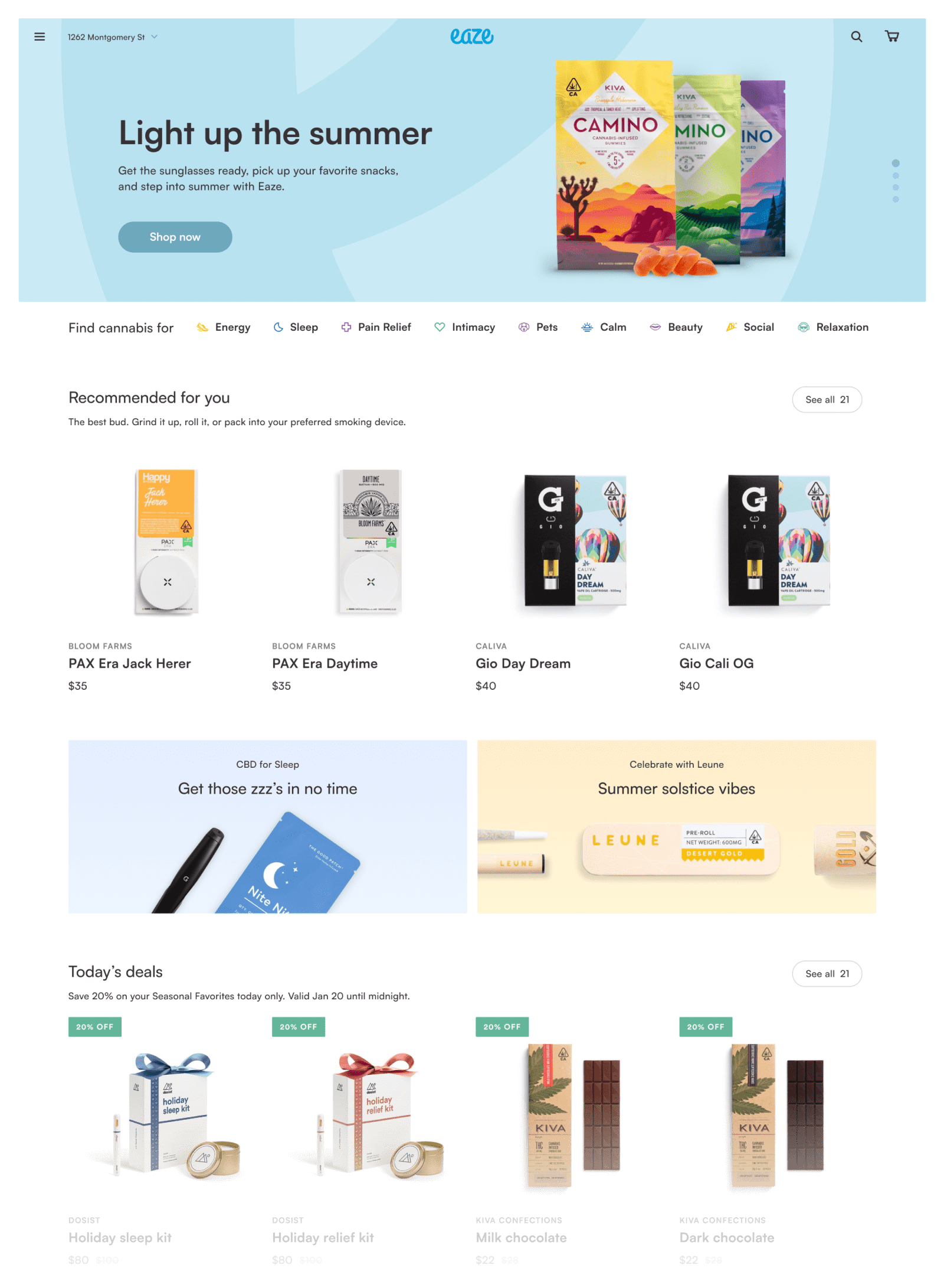
The new Eaze shopping experience combines the effortless browsability of a modern storefront with a refreshingly clean experience for the shopper. Users feel a sense of trust in their purchase.
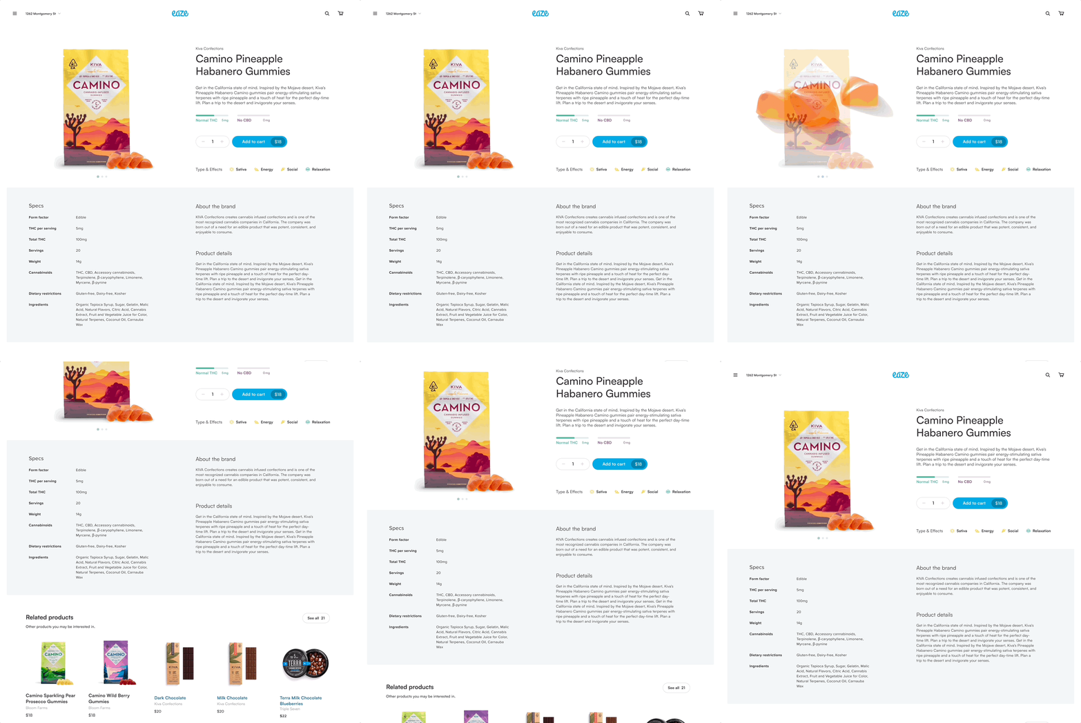
Novice users are presented with helpful information, like THC/CBD level meters and a handy Type and Effects chart. Advanced users can dive into product specifications, learn about the brand, or read the product details from the brand themselves.
Both novice and experienced users alike really wanted to get to know the brands that they were purchasing from. I advocated for dedicated brand pages, where users could familiarize themselves with brands and the faces behind them.
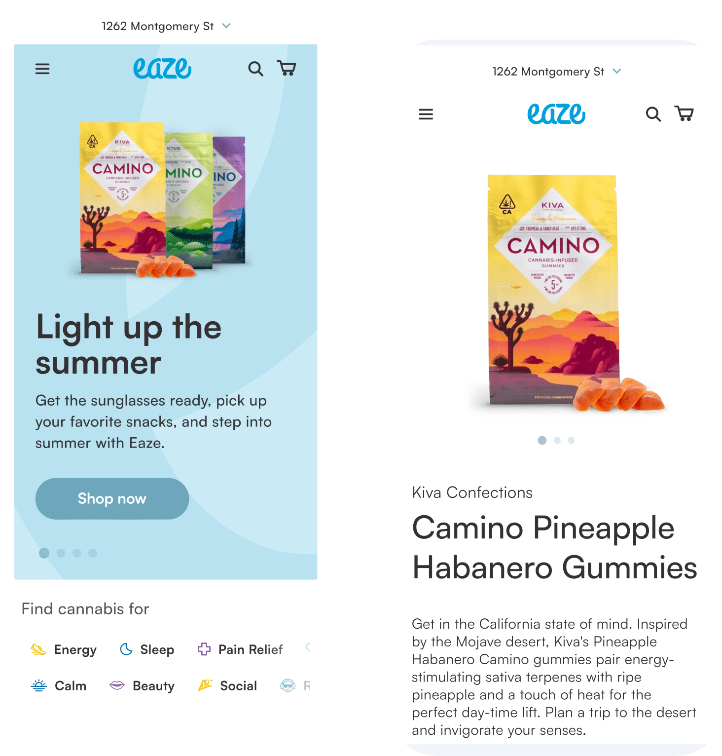
The new experience was designed mobile-first, allowing users to shop from their couch, office, or on the go. A major emphasis was placed on the shopping experience feeling seamless between mobile and desktop experiences.
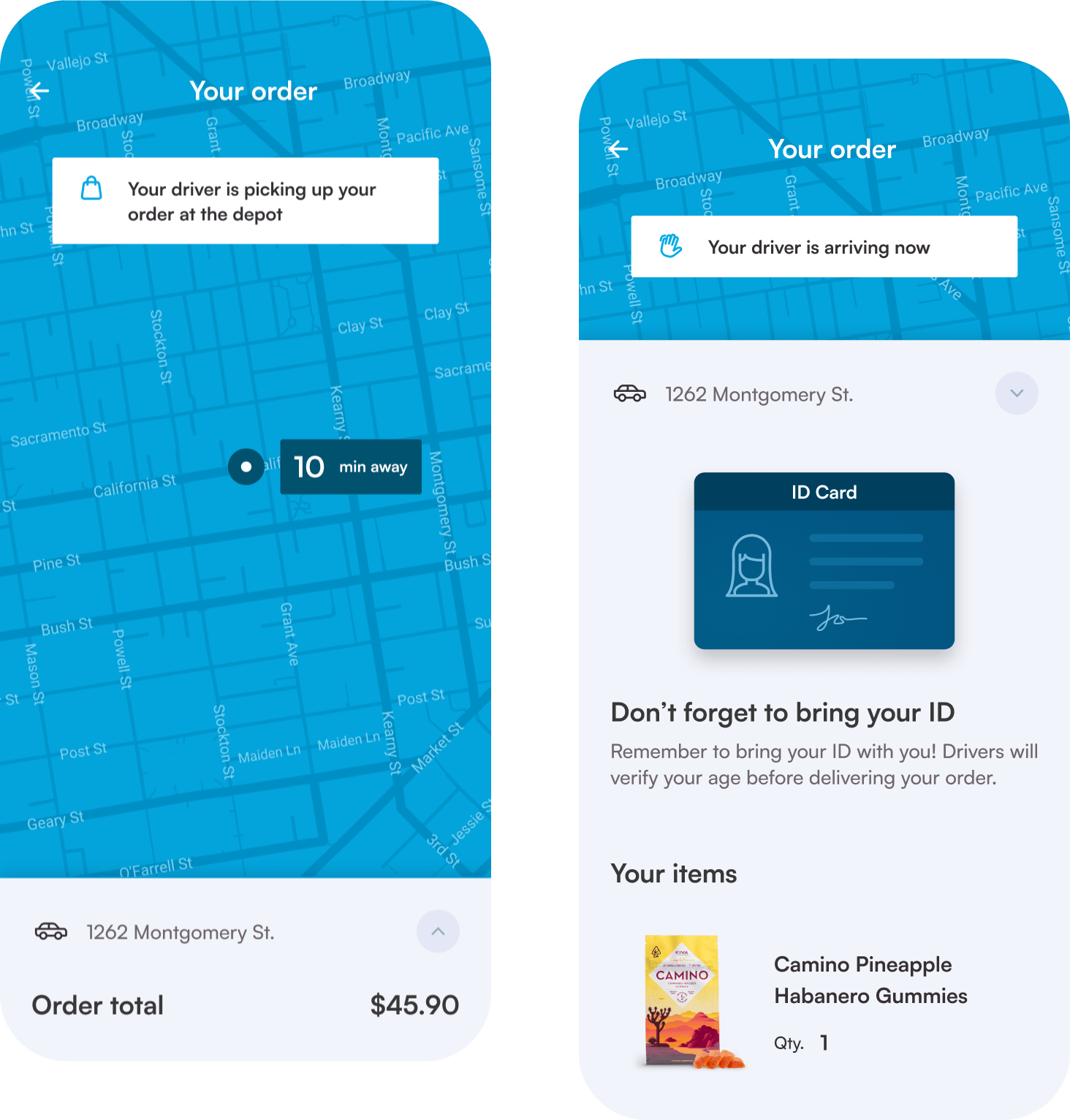
Once the user completes their purchase, they can follow along as a driver picks up their products and delivers them straight to their door. The user is alerted at every step of the way and reminded of key information to ensure a smooth delivery.
Increase in order volume
Rise in order value
Users felt more confident in their purchase
Combined user research and feedback form
The most eye-opening feedback received from users came from coffee interviews with people on the streets. Oftentimes, it helps to break away from interviewing your most vocal users and get outside perspective from potential customers.
The initial designs would have probably gotten us 60% of sales, but were missing key functionality and components that built trust in users. By refining and iterating on the initial designs, the conversion rate was vastly increased.
While I led this initiative, it was great to build out a small team to complete these tasks. By having two people conducting user interviews, we gathered information quicker. With a junior designer on the project as well, less critical workflows could be delegated out so I could remain focused on the larger picture.
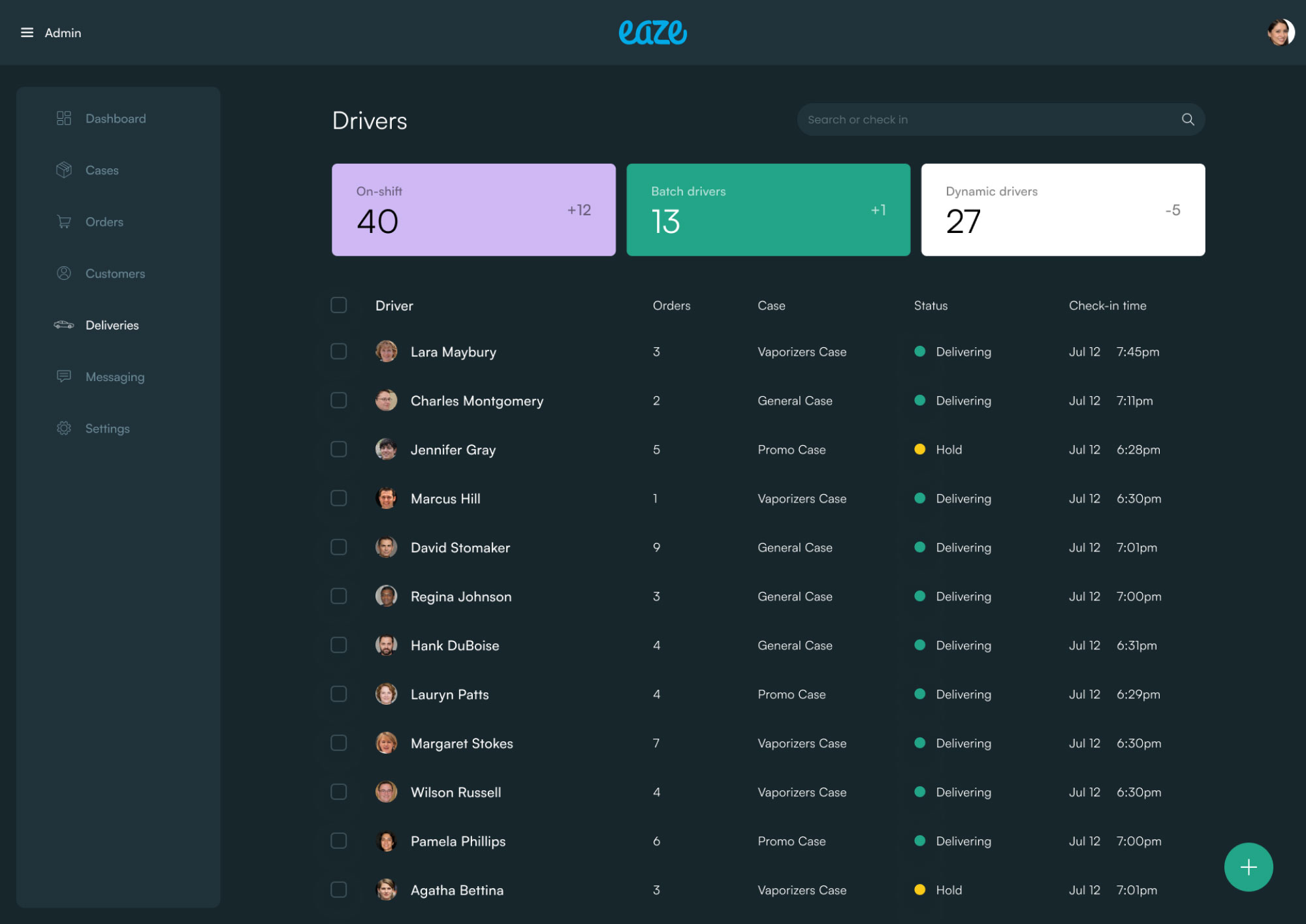
In addition to the consumer shopping and checkout experience, I also led the design of the systems that run Eaze behind the scenes. The driver app was the hub for the driver experience on the go.
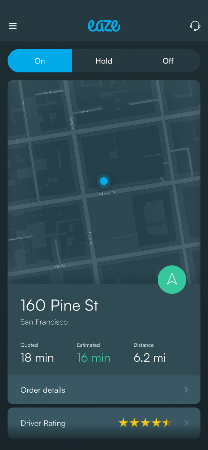
There’s an entire ecosystem of in-house built systems that run Eaze. I led design for many of these, including the driver dashboard, inventory management, order management, and accounting systems.
