Product design
Concept
User research
Product design
Prototyping
Figma
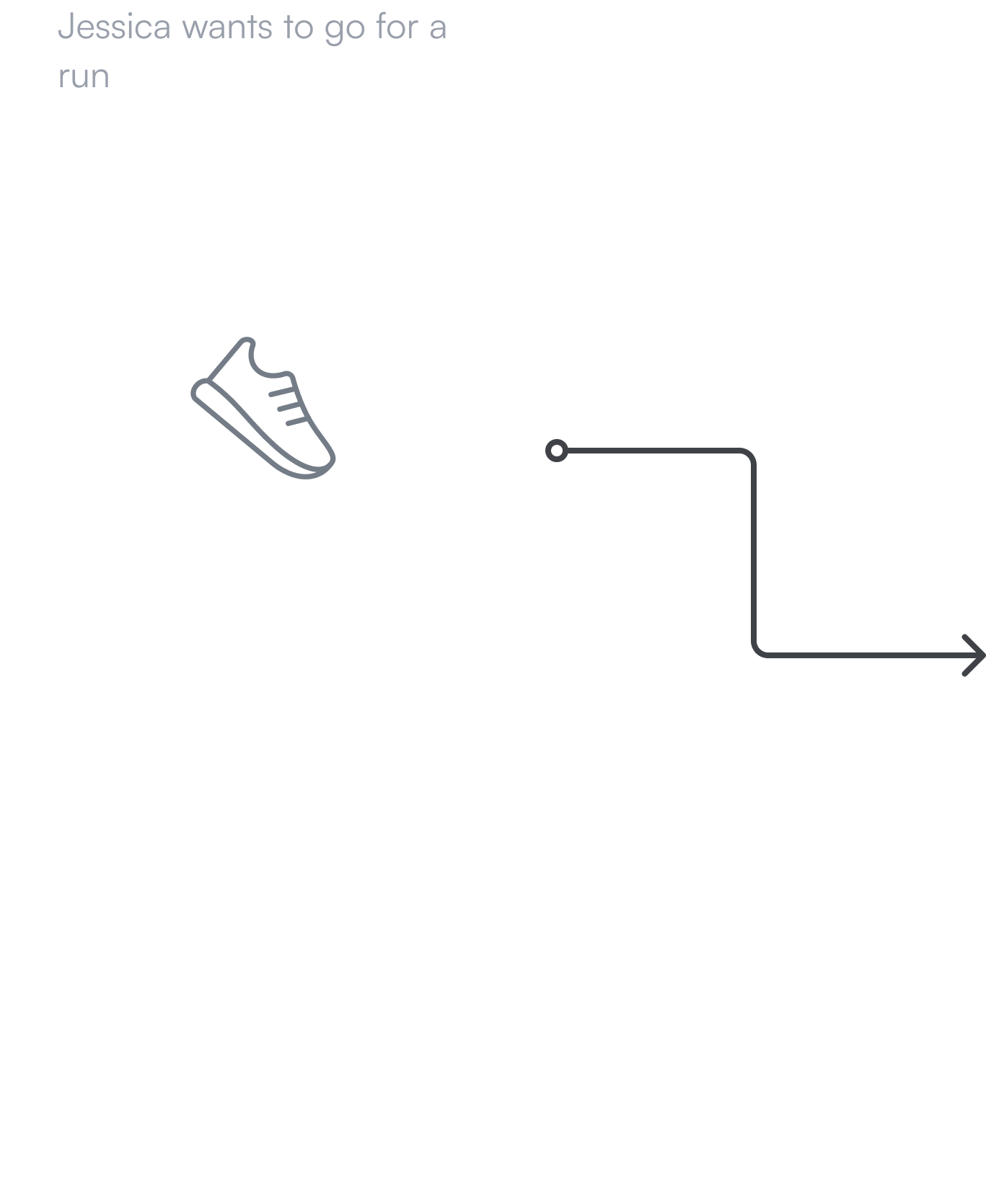
Strava connects millions of runners, cyclists, hikers, walkers, and other active people through the sports they love – all on their mobile app and website. I’ve used Strava for nearly a decade and it’s become my go-to app for any active sport I participate in.
I envisioned an app I know and love in its future state, with a full slate of product, design, and engineering processes in the rearview. What would make me open it up before a run, hit record at the top of a snowy peak, or check my stats after a particularly long mountain bike ride? What could make this app used by millions take the next leap forward?
Strava is the industry leader in the performance tracking app space, despite huge names out there like Nike and Apple attempting to encroach. I’ve used Strava for over a decade, and while I love what it does, I couldn’t help to think about what it could be in the future.

I contacted friends on Strava, asking what they used it for, what worked, and what was broken in their current workflow. I wanted to learn what they wished the app could be. I then surveyed the competitive landscape, taking note of the offerings from other major competitors and where they stacked up.

I mapped out key workflows through Strava, and began to sketch out ideal journey maps through each flow. I also roughly mapped out key paths through competitors apps so that I could compare the landscape.

As I sketched out the workflows and spoke to users, several issues became apparent as key problems for the current users.
1
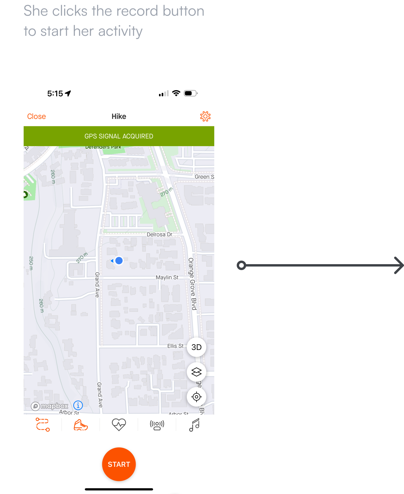
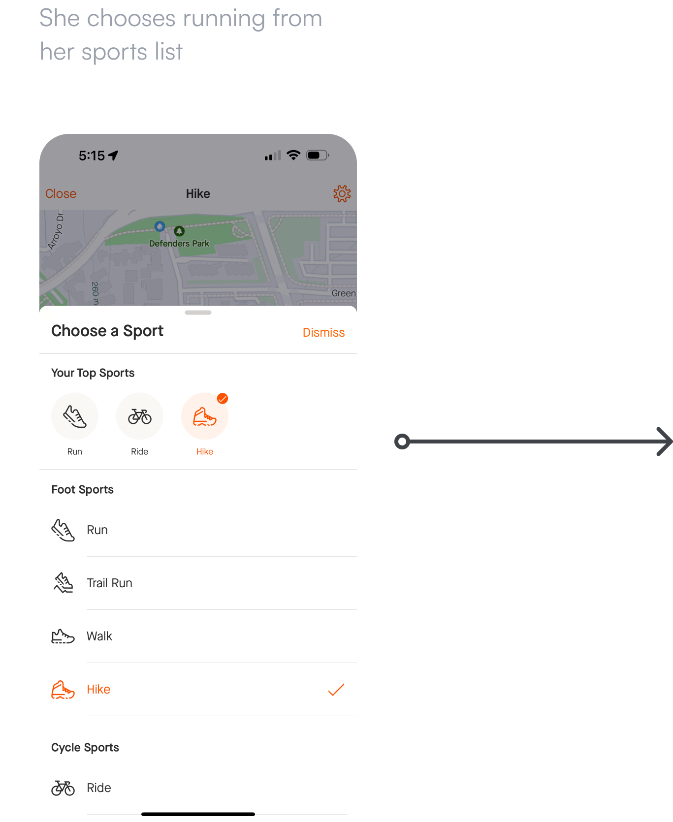
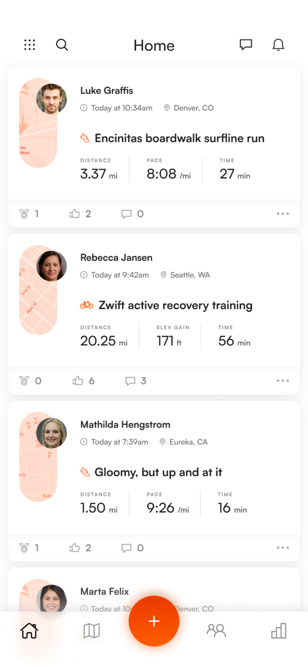
New or unfamiliar users had trouble finding the path to starting a new activity. A priority was placed on surfacing the “Start” flow and the button that initiated it.
2
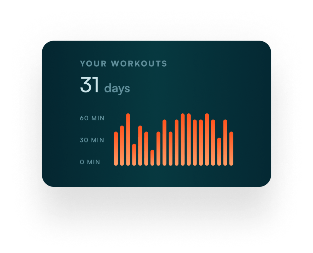
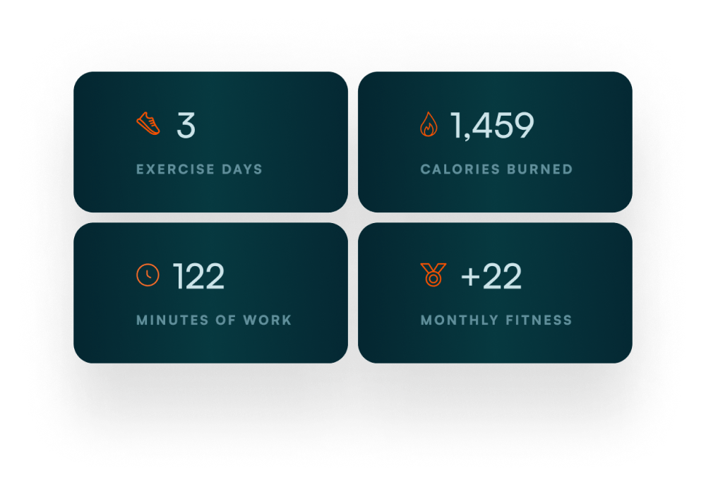
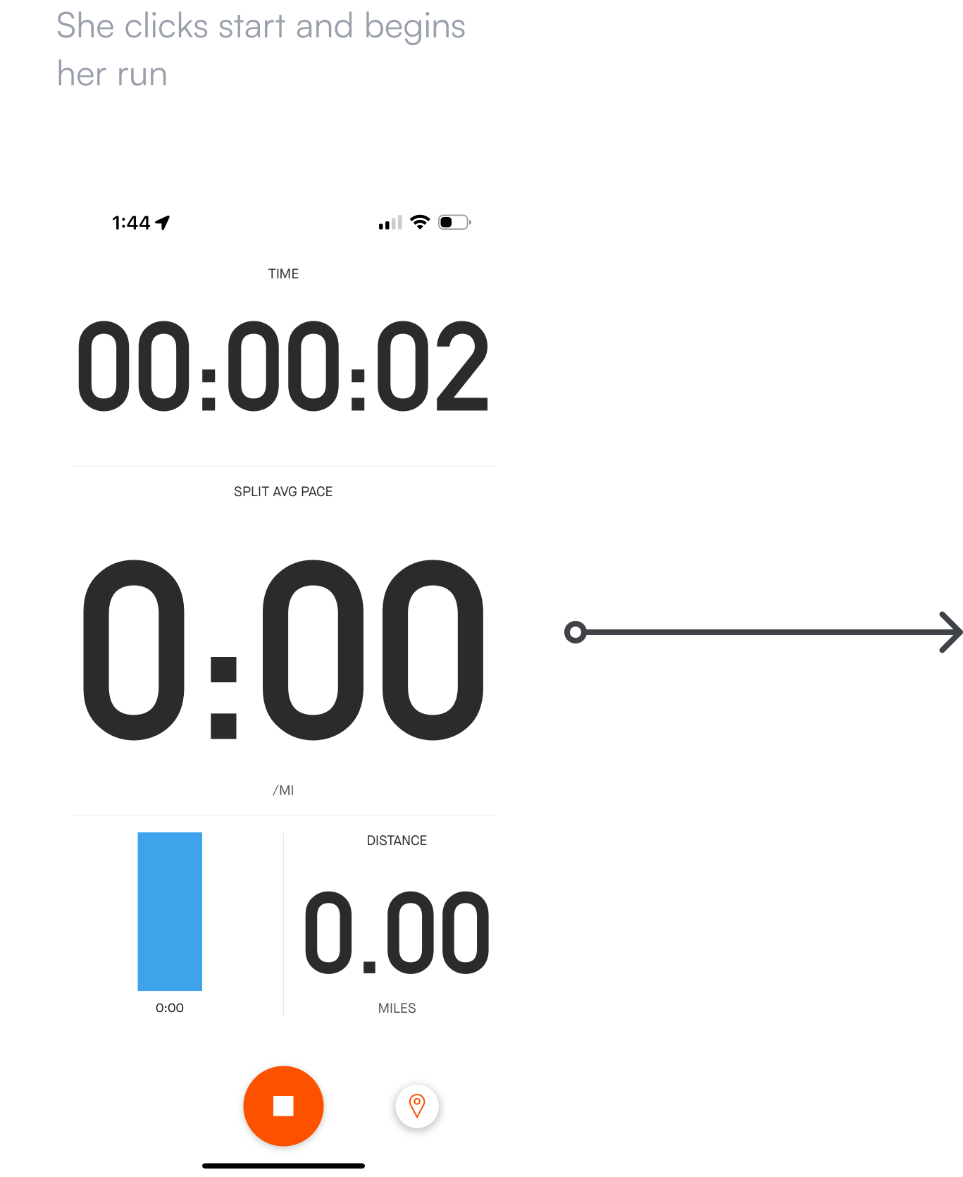
Users love data, but found it difficult to both find relevant data and parse it meaningfully. Analytics were noted as a key consideration in this redesign.
I designed rough wireframes of key screens from the workflows. These shed light on areas where flows could be improved and focus needed to be shifted, including further emphasizing the start button and reorganizing the analytics. I then created high-fidelity mockups from these learnings.

I brought my mockups back to the Strava users and generally active people in my circle. Many current Strava users wished that the app could be moved over to my redesign today. A fellow designer asked how far in the future my designs were meant to convey. This got me thinking. Was I interested in designing V2 of the current Strava experience, or did I want to push it 10 years into the future?

I began to think about the voice of this future Strava. What set it apart from the Strava of today? For branding, I chose the font Satoshi, a Swiss-style modernist sans serif type family characterized by the play between elegant rounded shapes and sharp angular details. I kept the already impeccable Strava orange and accented it with teals and a mint secondary.

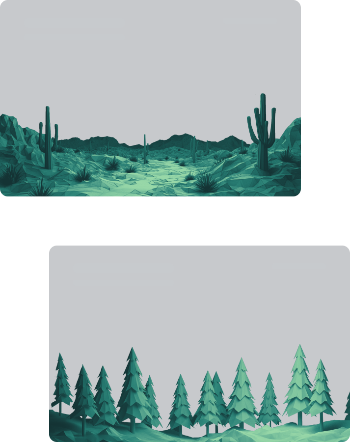
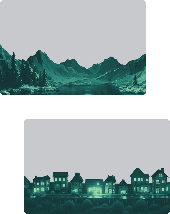
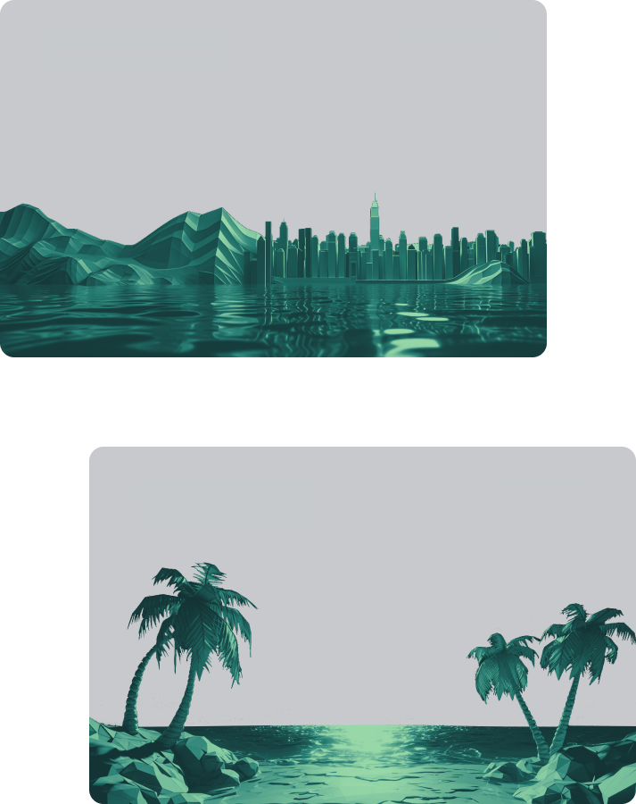
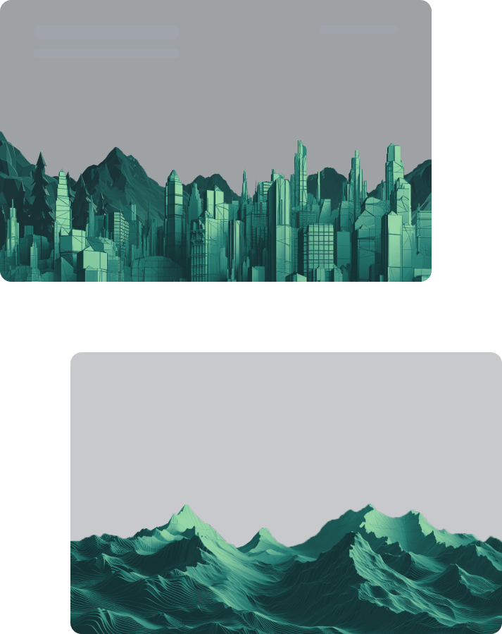
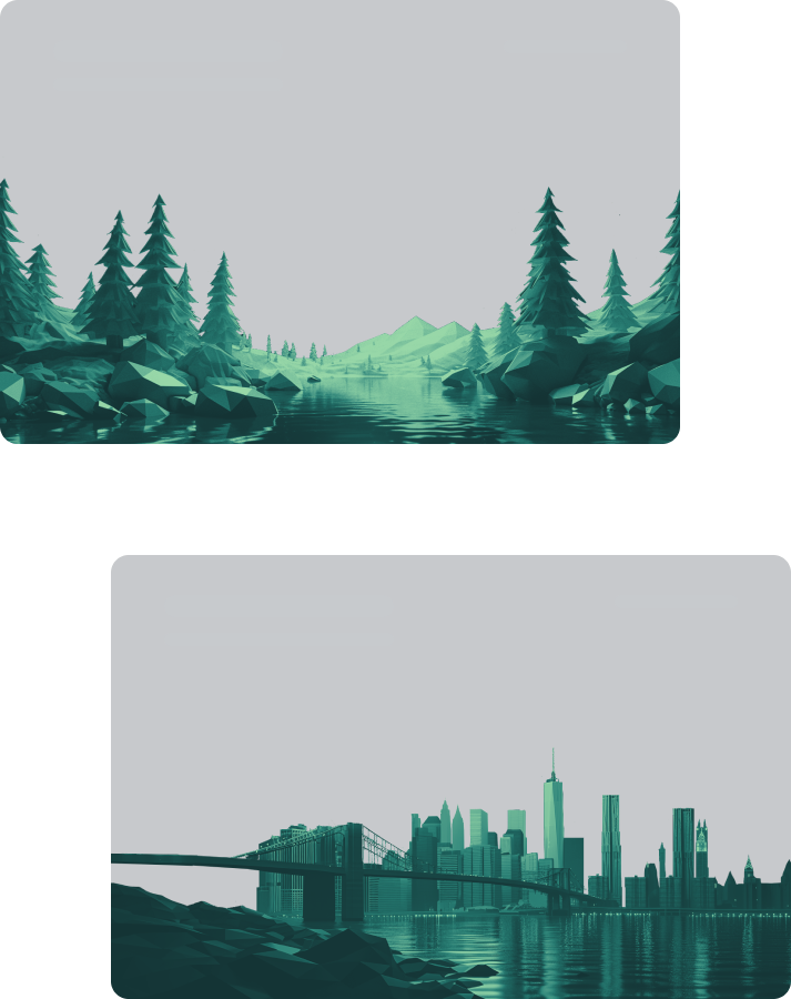
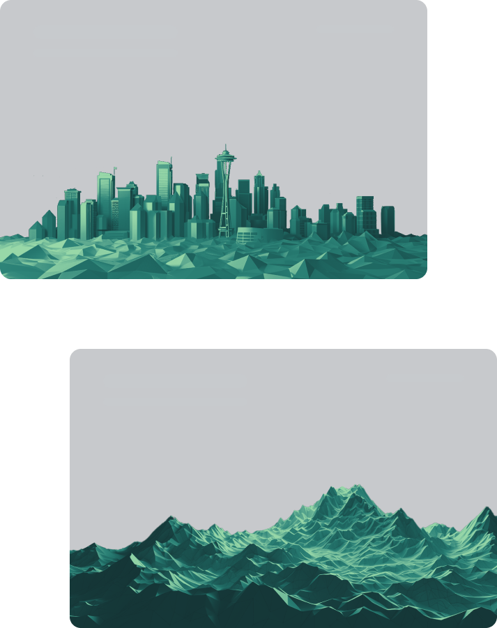
Strava users are defined by the incredibly diverse terrain that they encounter. To honor this, I created a set of low poly 3d rendered scenes of the varying landscapes of the earth. These images help distinguish each athlete’s activities, highlighting their unique daily challenges.
With the building blocks in place, I designed hi-fidelity mockups and a prototype of what I branded as Strava 2040. I designed the interface with several pieces of user feedback in mind, including a key insight that most users prioritized rapidly starting an activity. I increased focus on the activity starting workflow and made it exceedingly simple to get moving quickly.


Strava connects millions of runners, cyclists, hikers, walkers, and other active people through the sports they love. It’s time to bring the Strava experience into the future.


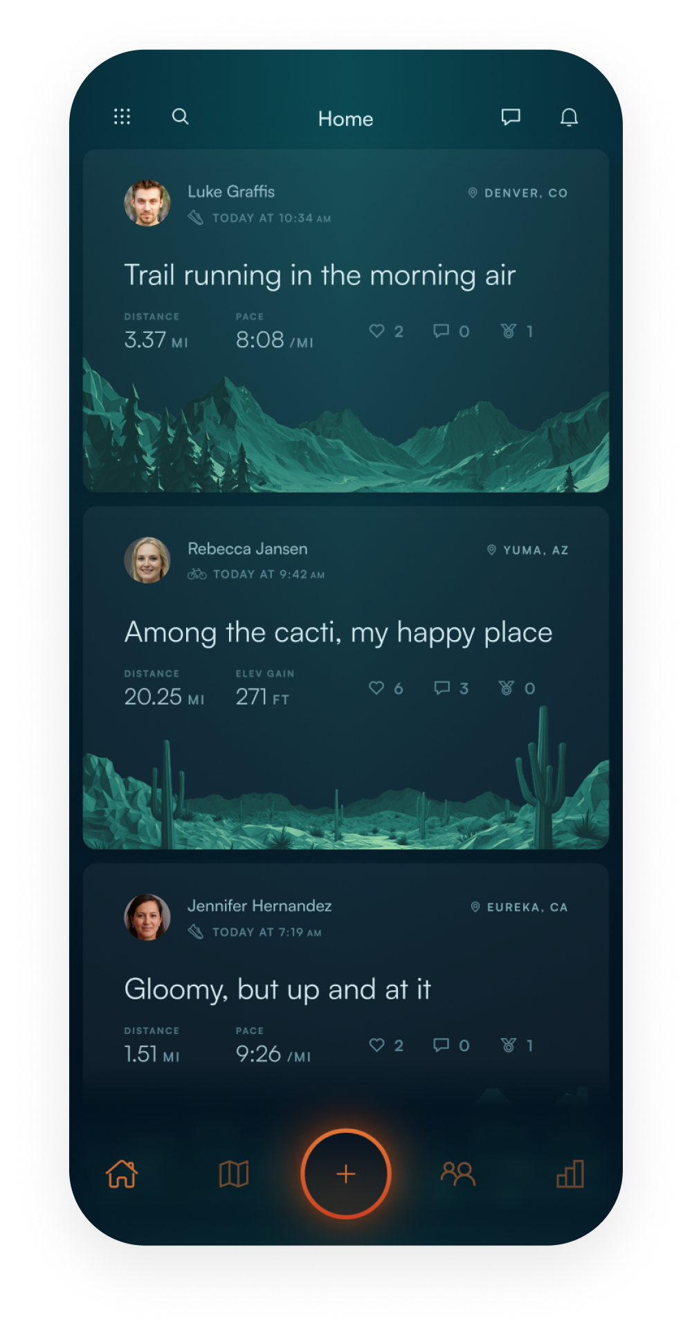
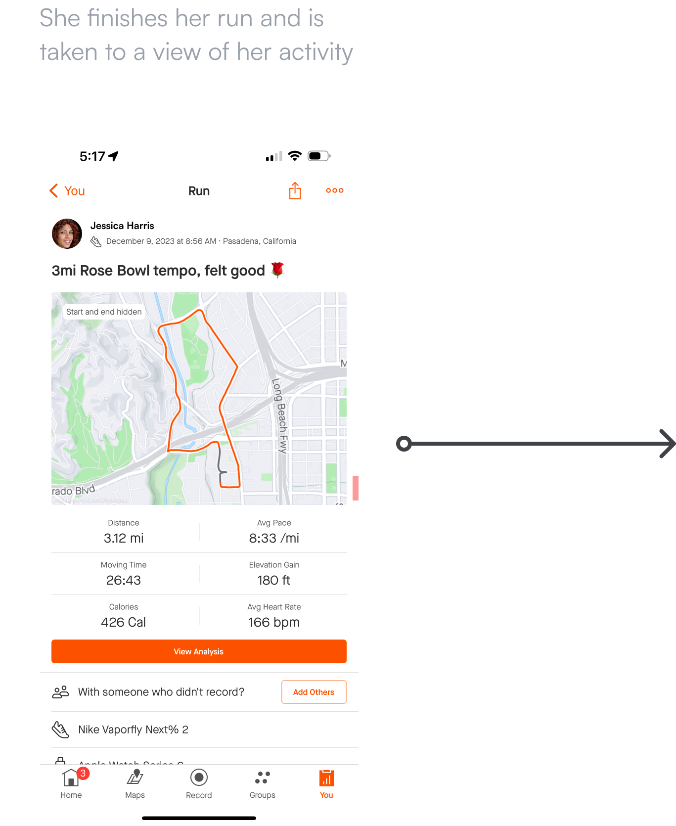
While Strava users enjoy socializing on the app, their main focus when opening the app 75% of the time is to start an activity. The start activity button and flow were redesigned to be more prominent and get you on the move faster.
The activity start screen was redesigned from the ground up, with a focus on selecting your activity, aiding the user with finding an ideal route, and getting them out and moving.

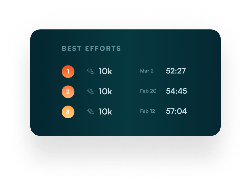
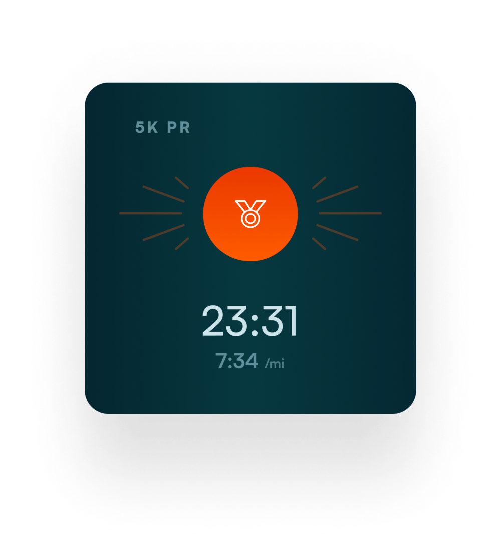
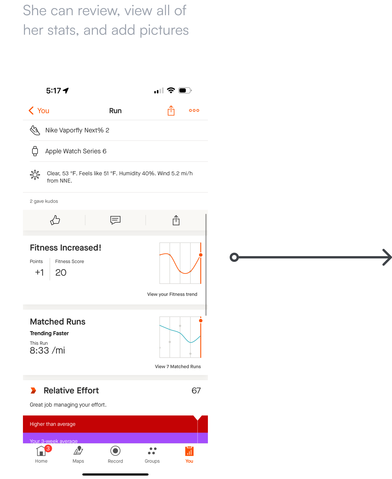
Strava users love their data. They analyze their activities, compare them to their previous efforts, and check how other people did on the same routes. The analytics were redesigned to engage the users and highlight the data they were asking for the most.

Run, share, comment, track, analyze, and improve. With this redesign, users can hit the ground running, cycling, or wherever their feet take them.

Your first instinct might be to start right away with a fresh redesign. But, don’t put the cart before the horse. Model the key workflows, talk to your users, and decide on the key concerns your users are facing. Focus your initial efforts on those concerns, and your redesign will emerge from these solutions.
It’s tempting to slap a fresh coat of paint on an interface and call it a day, but that will only get you so far in product design. In order to grow as a designer, sometimes you need to take a step back and decide if you should be working on a grander vision. “You mustn’t be afraid to dream a little bigger, darling.”
Users are a treasure trove of insights that can inform and shape your design decisions. This project began with certain assumptions, that ultimately were redirected by speaking to key users and really listening to their concerns.