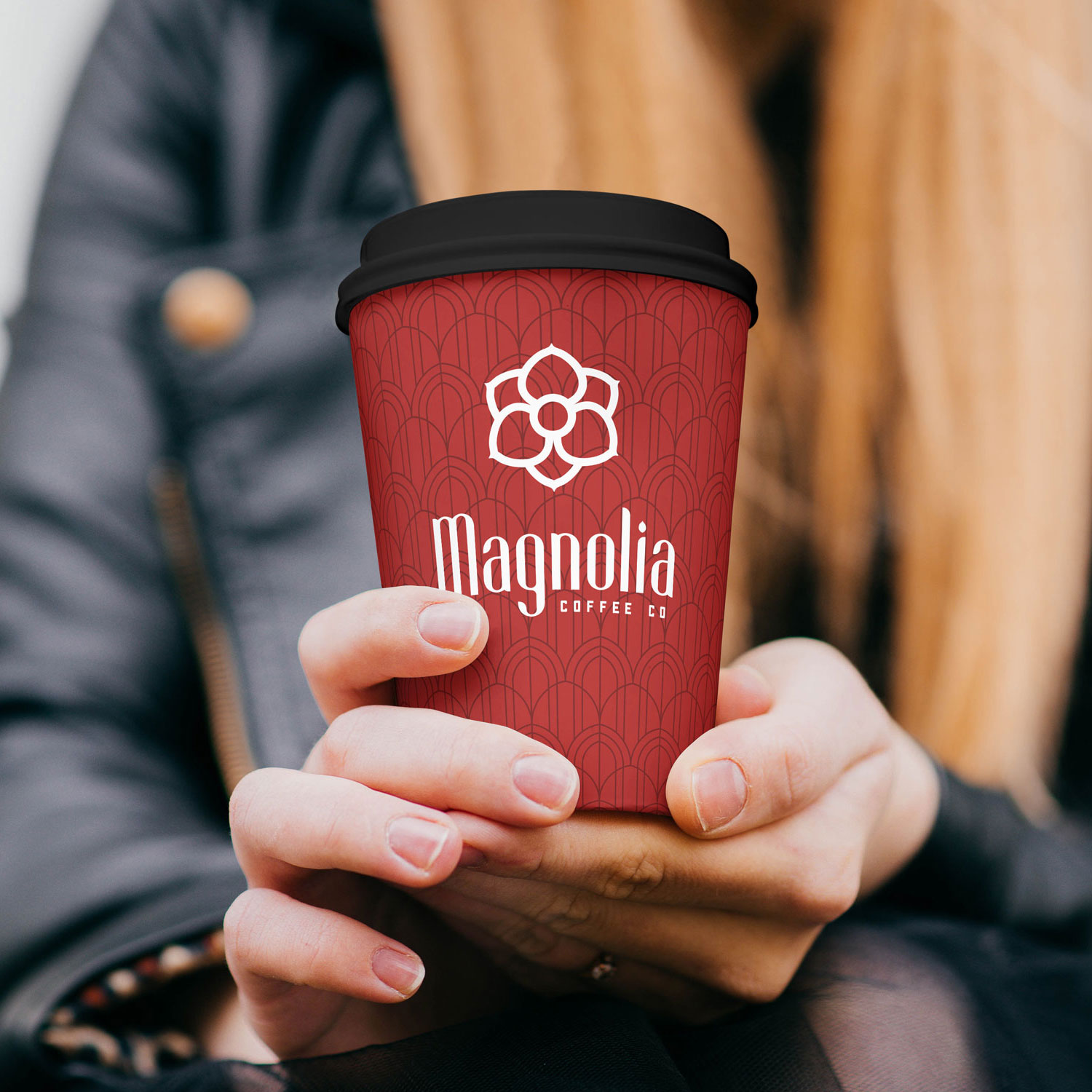
I was brought on to this exciting project to help reconceptualize the branding for Magnolia Coffee Co. The company already had a strong name, but the branding needed a refresh to match the incredible product. Research began by gathering the wide array of coffee brands currently making a splash worldwide and deciding where Magnolia felt they fit into that spectrum.
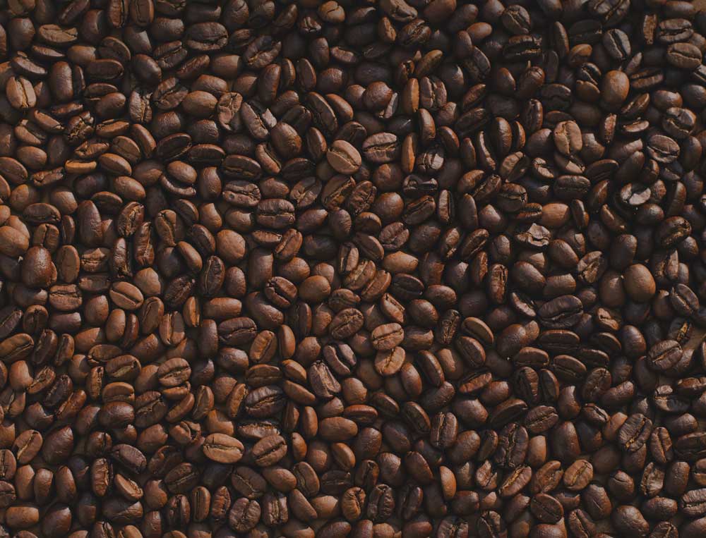
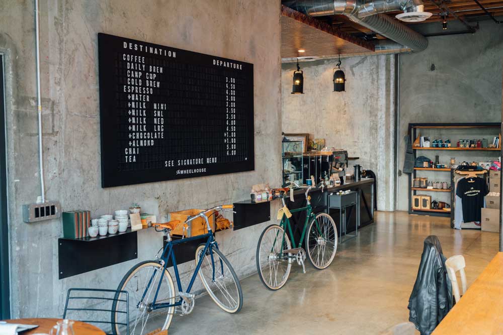
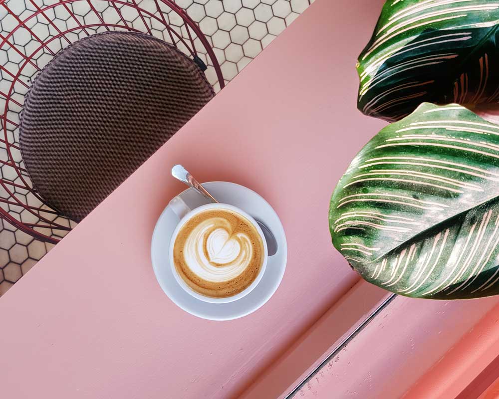
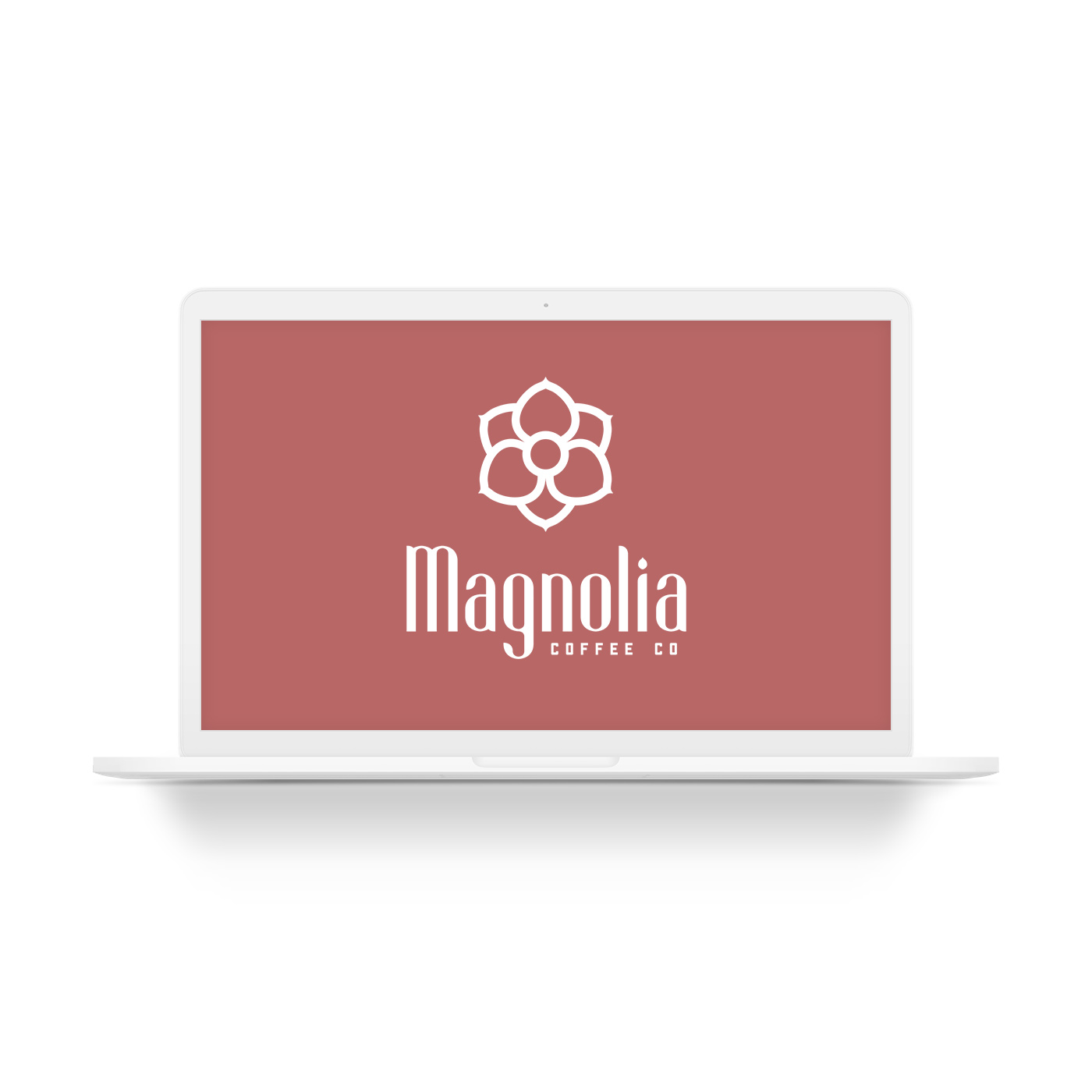
Magnolia’s branding is refined and slightly feminine, catering to the refined coffee drinker with a bit of style. A boutique as much as a coffee shop, an experience as much as a coffee, Magnolia is about all of the little things that encompass the coffee world.
A magnolia flower springs forth from the packaging, a symbol of freshness and tranquility, a bright and vibrant bloom of flavor. The wordmark is sharp, yet refined. A combination of a modern condensed and highly stylized face with a much more classic complimentary face to evoke those classic coffee roots.
